Want to see the collections I send to art directors for licensing? Download the PDF here:
If you dream of licensing your artwork, working in collections is a must. Simply put, presenting more artwork to potential licensing partners = more opportunities for sales. 💰
And… bonus!
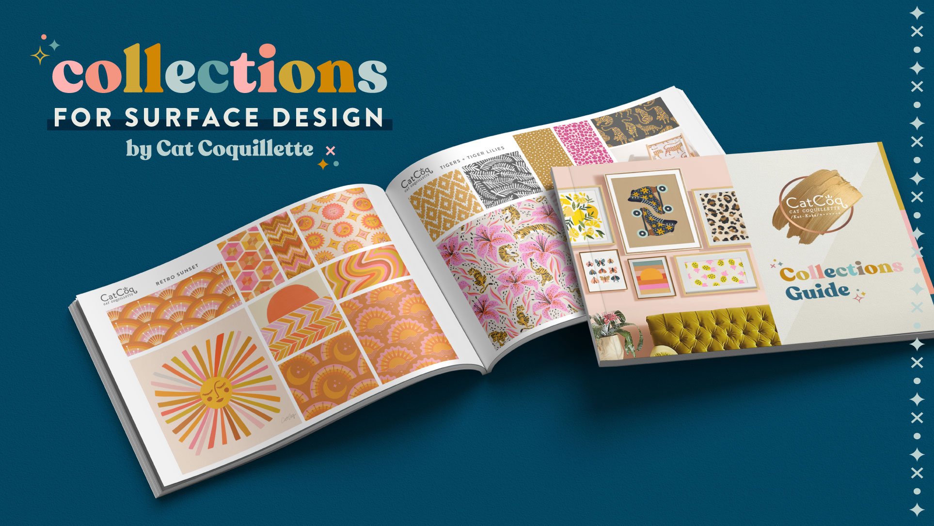
I put together a PDF of the actual collections that I use to pitch to licensing partners and art directors in a free Collection Guide for you! I hope this gives you some inspiration as you’re putting together collections of your own.
Here are three of my top tips for creating cohesive collections:
1. Build your collection around a common theme or hero image
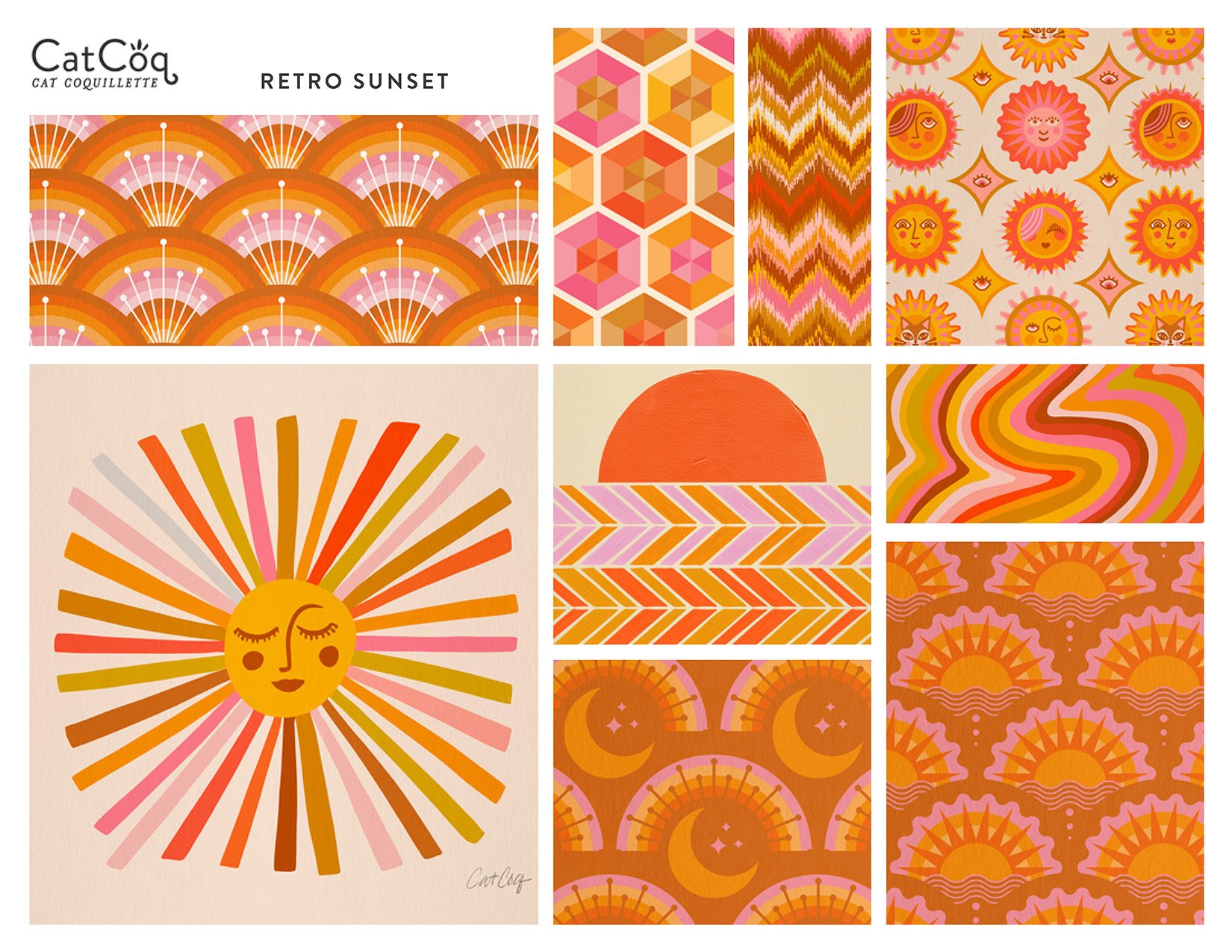
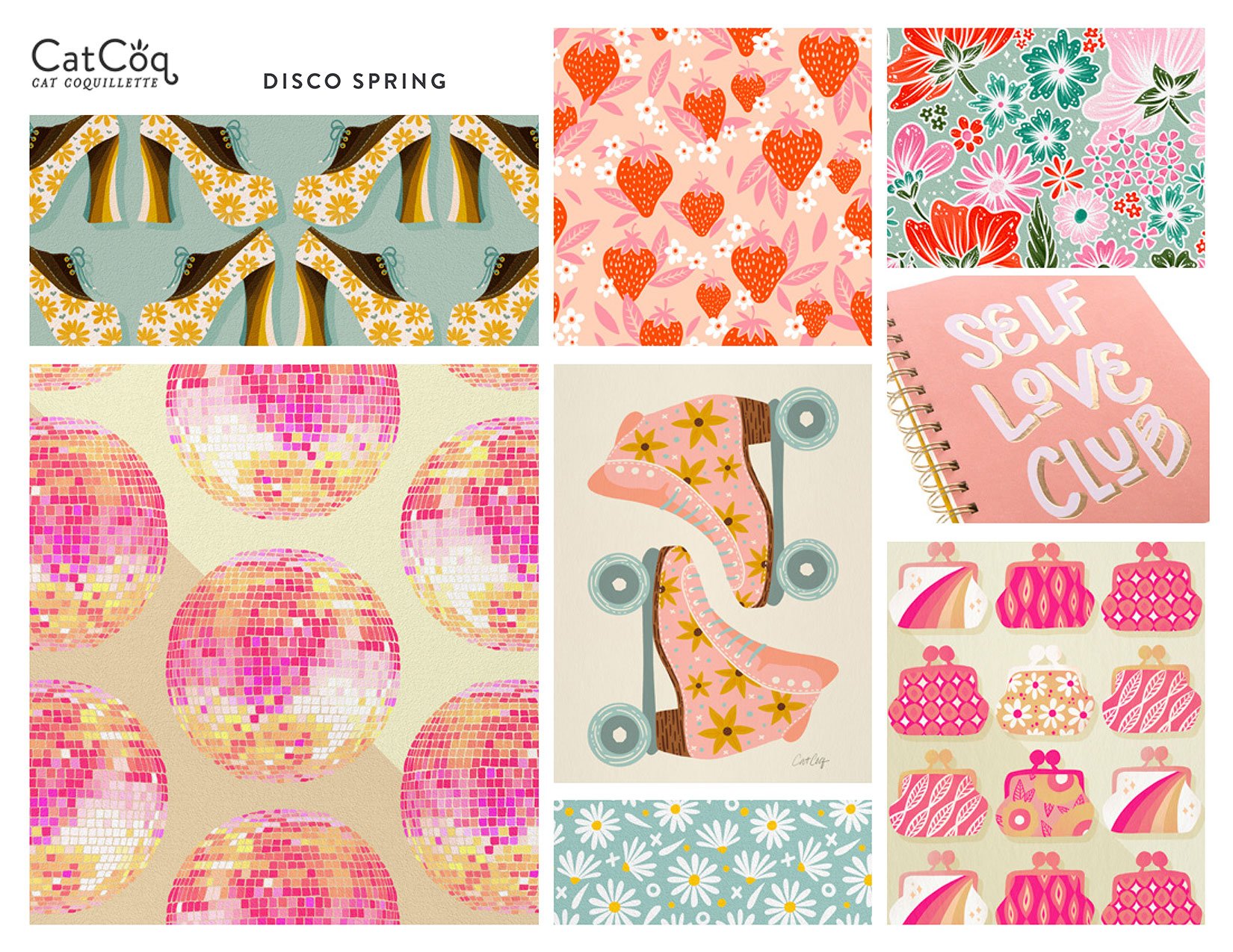
I typically create my collections by starting with a hero image or theme and building the rest of the collection around that. The hero is the main image in a collection and all of the other patterns support it. This way, when you’re presenting it to a potential licensing partner, they can envision how the different designs might work together on different products.
Learn how to whip up seamless patterns just like this in my class, Seamless Patterns - available both in Photoshop and Procreate!
2. Use a cohesive color story to unify your collection
Color is one of the easiest ways to create cohesion in a collection. But what if you have a lot of artwork that goes together thematically but doesn’t match color-wise? That’s where color alterations come in. You can easily change the color palette of your artwork in Photoshop so that it can fit into any collection!
Learn how to turn one design into a dozen different color variations in my class, Cultivating Color.
3. Build variation into your collection
While it’s important to have cohesion in your collections, you also want each design to be able to stand on its own. Make sure that the designs in your collection look like they belong together but vary the size, color, and subjects so that not everything looks the exact same.
All of the artwork on this page was created on my iPad in Procreate. Enroll in my Procreate Bundle and learn how to create professional-level illustrations with ease!
The bottom line: Collections make your portfolio feel cohesive and professional, plus it’s a nice little nudge to the licensor to choose more than just one design– they may decide to pick up several designs that work well together in order to create a well-rounded display. That’s a win/win for everyone!


